About 2 months ago we embarked upon the process of redesigning the castos.com homepage and marketing site. The previous design served us well for the last 2 years and, just like the new site, proudly ran on WordPress.
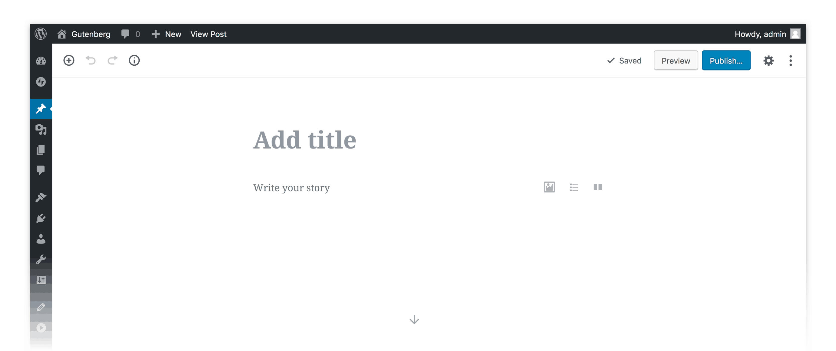
With the introduction of the Gutenberg block editor into WordPress core in release 5.0 we thought this would be an interesting experiment to see what redesigning a SaaS marketing site, blog, and podcast area in the Gutenberg editor was like.
I blogged a bit about some of the “best practices” I see in SaaS homepages a while back, and with some of that inspiration in mind Eileen Violini from our team and I went off to create an entirely new marketing site for Castos.
We had a few absolutely requirements for the site to begin with:
- It had to be fast: both Google and our customers reward us with fast loading times and so a slow site (no matter how beautiful it was) just wasn’t an option
- Had to be made with Gutenberg blocks: this is undoubtedly the future of WordPress and being a WordPress centric tool with our Seriously Simple Podcasting plugin we felt it is our responsibility as an active member of the community to show what this new editor can do.
- Had to be great looking, and incorporate many of the best modern design patterns: to start with this meant a very clean layout but also the use of some stunning illustrations
- It has to be flexible: the thought of building solid code blocks of custom HTML and CSS in a page template just wasn’t an option, as easy as that is to get from PSD to webpage.
With these guard rails in mind we set off to begin to build an initial wireframe version of the site.
The Design Process
In retrospect (now that the entire process is complete) the one thing that would’ve made the implementation of this project faster would be to spend more time in the ideation and iterative creative phase of the design process.
We went pretty quickly from wireframes to implementing it in WordPress.
The best-case scenario instead would be to use a tool like Marvel to create higher resolution wireframes of exactly what the pages would look like before moving into code/blocks.
Instead, we made the fine-tuning design process in WordPress, which is just always harder than in any kind of design tools like Marvel or Sketch.
Creating the site in Gutenberg
In the recent WordCamp Europe talk Matt Mullenweg gave an interesting insight into what Gutenberg would be in the future. Needless to say, it’s where WordPress is going, so we all need to get on board (if you’re not already).
That being said the core Gutenberg editor is a bit limited in doing some of the more advanced design parameters that we had for the site, so we added to it with a couple of additional block libraries.
Namely, we used:
- Coblocks: Developed by the team at ThemeBeans this blocks library adds a lot of functionality when it comes to extending the existing design capabilities of Gutenberg. For us this was things like Columns and Rows
- Atomic Blocks: This powers our Accordian view and some of our Testimonials
- GhostKit: This powers our Testimonial areas as well as the image slider we use to displays some of the podcasts that are hosted on Castos.
The rest of the functional design pieces were all covered by the core Gutenberg blocks.
Many of these we one-off blocks but we did use Reusable blocks in areas where we had exactly the same content/format on several different pages. It’s nice to be able to drop these blocks in individually on a page instead of having to bake this into the theme itself.
Themes and Gutenberg
One of the interesting questions at WCEU of Matt was what the future of themes held in the Gutenberg era. Same question I think can be asked of what the future holds for themes in the pagebuilder era in general.
The response is likely that themes will be just very different than they are today. Today themes are actually rather rigid boxes into which your site needs to fit. With the advent of blocks or pagebuilder type elements you might think of themes as just styled pieces that you can insert into an otherwise blank page. For instance we use several different styling and content blocks in our site, where the theme controls very little of the look and functionality.
We’re using the Coblocks theme as the base, on top of which of course we have a customized Child Theme. The theme itself is very lightweight and fast, and most importantly it gets out of your way so that you can build the site from the ground up with Gutenberg.
Parting thoughts
Overall we’re extremely happy with the final product that we have with our new marketing site and the use of Gutenberg ended up being quite a powerful tool.
As the editor is still relatively new there are some aspects that aren’t covered in the main editor, but between Coblocks and GhostKit we’re covered in terms of functionality.
If you’re considering revamping your SaaS marketing site and it’s already running on WordPress I’d take a serious look at using Gutenberg as the engine through which you design and implement your new site.

Comments are closed.