5 Podcast Design Tips For Eye-Catching Visuals

Whether you’re a veteran podcaster or are just getting started, you’ll definitely want to give some thought to the visual components that go into your podcast! Visual branding is as important as audio branding in your podcast.
Branding goes a long way, especially when you’re trying to make a lasting first impression on a potential new subscriber. I know this may feel overwhelming at first, especially if your past experience has been in audio more than in graphic design.
Well, thankfully, gone are the days of needing to hire a designer for every little design project! With the proper online tools, you can create captivating graphics for your podcast that will give the strong impact you so desperately desire.
Keeping all this in mind, I’m going to give you 5 podcast design tips to help you create engaging cover art, as well as suggest some awesome free tools you’ll love. So let’s jump right into it!
Podcast Art Sizing
First of all, the most crucial thing to consider is that you’re using the correct size requirements. This will determine if your podcast is professional or campy looking. There’s nothing worse than a pixelated blurry cover image, and so to avoid this, we recommend following these guidelines as stated by Apple:
This will ensure the best legibility and help guarantee that your first impression is a good one!
As well as your main cover art, be sure to create your icon and channel art all at the same time, to create a consistent look across the board.
Set the Visual Tone
Next, you’ll want to decide what visual tone to set for your art.
Is your podcast serious?
Comedy or crime-related?
This will determine whether you’ll be using strong darker colors, bright and fun colors, funny images, or professional portraits.
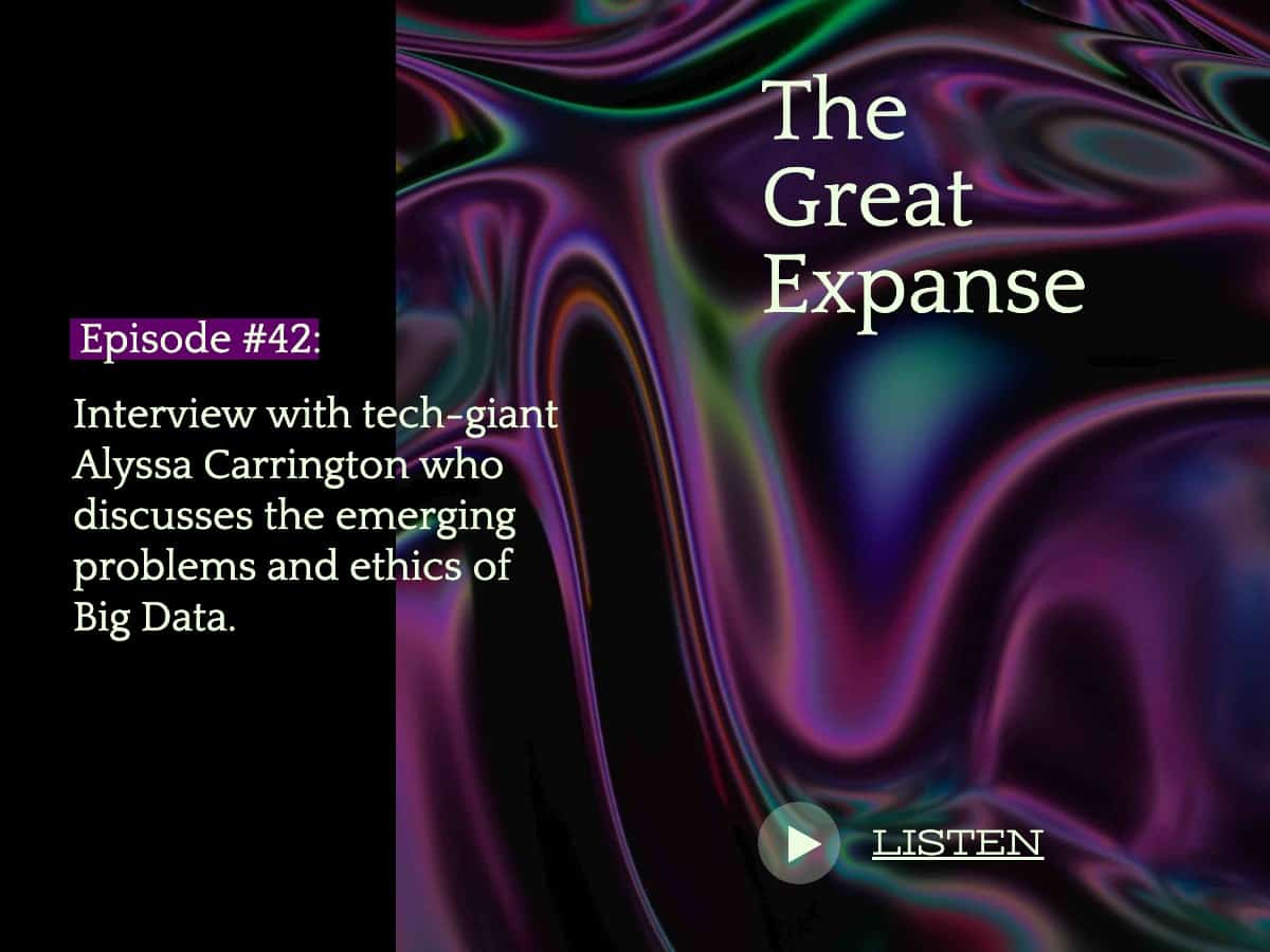
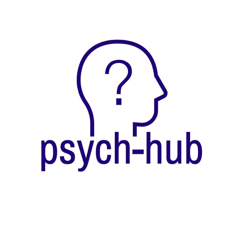
This pre-made template for a non-existent podcast ad shows how dark colors and crisp typography create a strong and professional look. Notice how the strength of this classic design gives off the impression that the podcast is a supreme authority on the subject.
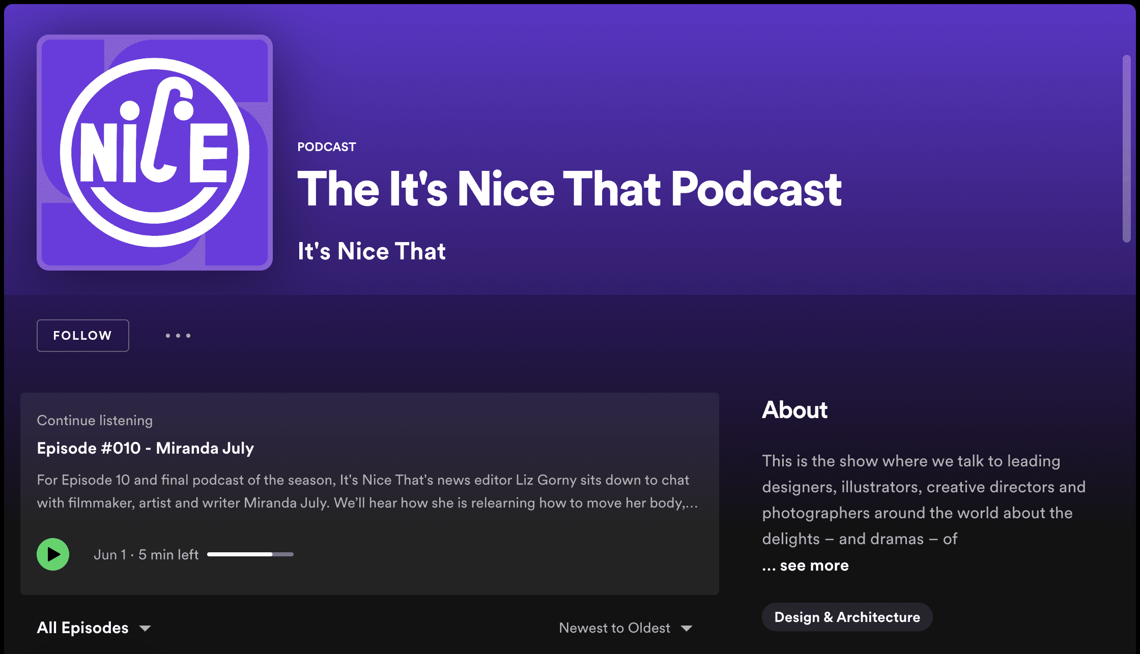
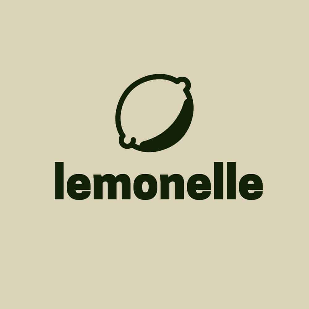
Another example shows a playful and fun side of the spectrum. See how the soft yellow color and food spread creates a sense of relaxation? This style would be suitable for a food or cooking podcast. Notice it also reflects an easy-going casual vibe. With the podcaster’s name up-front and bold, you already know before listening that this podcast would be friendly, down-to-earth, and of course, food-focused!
Whichever your theme is, setting the tone is important, and an essential part in tying your branding together as a whole. Setting the tone is essentially setting the mood, and giving your potential listeners a clue as to what they can expect.
Color Contrast
Regardless of the theme, color contrast is one of the main foundations of design that I come back to, time and time again. It can take any one-dimensional looking graphic and make it basically glow, as your eyes attract to its perfectly paired shades.
One tool we love to use to create interesting and dynamic color palettes is Pigment by Shape Factory.
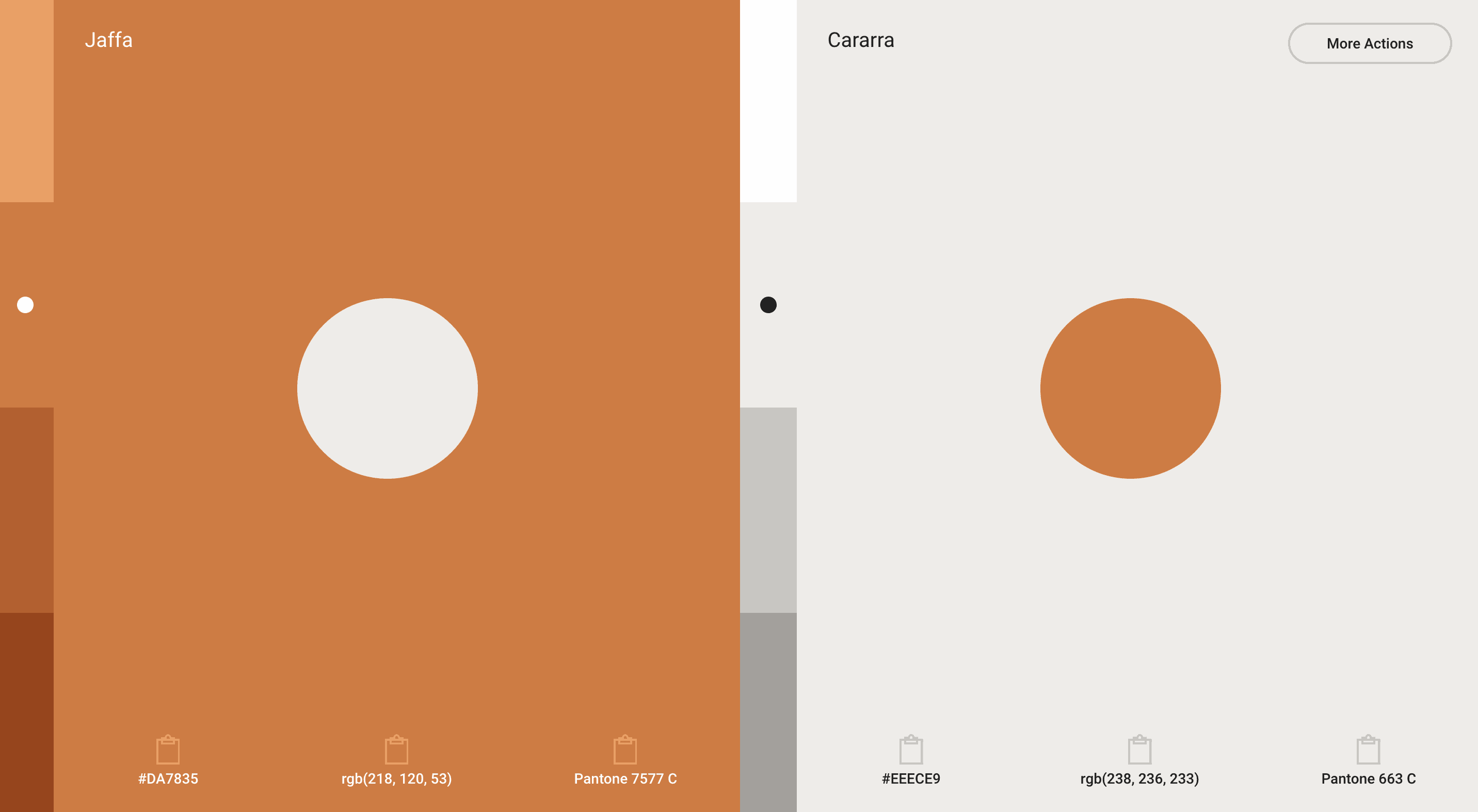
This tool not only allows you to copy hex codes, but it also allows you to swap out the hues of each color to nail down that perfect combo.
Between the ability to access thousands of pre-made palettes, or simply create your own, the options are endless! You’ll definitely be able to find a soothing palette, whether for your main branding or as a secondary palette to match your logo.
Now might be a great time to ask yourself: Does my logo utilize color contrast in the first place? This is something you should definitely consider, because a logo that pops from the get-go will create a stronger impact for your podcast.
Font Choice
If you’re starting from scratch and need a timeless font to start with, you can never go wrong with a clean sans-serif typeface over a simple background.
There are lots of awesome free fonts that are available online and commercially-free to use, so you don’t need to worry about breaking the bank for a great option.
We recommend fonts like Archivo Bold, Apfel Grotezk, or Cooper Black to bring legible text to your art. Whether you’re creating your title graphic for the podcast, a tagline, or adding some addition text to your existing graphics, these fonts will match virtually any style and color combo.
Of course, your font choice can have a bit of experimentation, but if you’re going to go for something outside-of-the-box, remember that in this case, legibility is much more important than the overall style. Sure, your style will create an overall mood, but the last thing we want is a podcast title image that can’t be read without the viewer squinting their eyes.
You’d be surprised at how captivating a design can be, simply with the dynamite duo of a solid color palette and a clean legible font.
The Small Test
Now that you have somewhat of a concept for your design, the last process in creating your art is the small test.
Basically, it is what it sounds like! Remember, your podcast will show up in all kinds of places online, big and small.
The small test will show you how legible or cluttered your art will look if it shows up on a listing somewhere at a much smaller dimension. So zoom out, export your art as 100px by 100px, and ask yourself, is this completely legible? You may find the logo itself looks great, but the tagline is hard to read. Or you’ll find you need to add some brighter colors to really make the design pop in a smaller context.
A great way to do this is by using Only Pod’s fantastic podcast cover preview tool.
Upload your art to their page, and they will show you how your podcast will be seen on Apple Podcasts, Google Podcasts, Spotify, Pocket Casts, and Podcast Addict.
Once you’re happy with the preview, and your art has passed the small test, you’re in the clear!
Final Thoughts
Now that you have a strong understanding of what goes into creating eye-catching art, it’s time to have some fun with it!
Even if podcasting is the centre of your content structure, the visuals accompanying your audio are crucially important.
Here at Castos we’ve created an entirely free cover art generator tool if you’re looking to design (or redesign) your cover image. And if you’re looking for more complex, ongoing design work we’re big fans of Snappa and everything you can design with their tools.
Launch Your Podcast In Minutes
Castos makes launching simple with one-click setup, automatic distribution to all platforms, and professional hosting. No technical skills required.
Start your 14-day free trial