Are you looking to beef up your podcast cover art? Wondering how to create a memorable artwork or a logo for your show?
FACT: Podcast cover art is the first experience potential listeners have with your show as they browse on Apple Podcasts, Google Podcasts, Spotify, or their favorite podcast app.
They’ll use your artwork to decide if they should read the description, skim your episode titles, or listen to their first episode. In short, the podcast cover is beyond critical for promoting your podcast.
Even though you didn’t get into podcasting to be an artist, you still need to take your podcast cover art seriously. So, in this post, we’ll go over how to create quality podcast artwork and a logo that helps grow your show.
Having trouble coming up with cover artwork for your podcast?
All Castos plans include the option of using our pre-designed cover artwork. Get your podcast launched quickly, then make adjustments down the road. See how it works on 14-day free trial.
Podcast Cover Art – Requirements For Apple Podcasts & Spotify
First, let’s talk about the technical stuff. Make sure you are podcast cover art meets this criteria precisely for maximum visibility. If it doesn’t, the podcast directories may fail to display your image or refuse to display your show entirely.
- Your podcast art should be square. Make it 3000 pixels by 3000 pixels. This way it will look good everywhere, even when scaled down. 1400 pixels by 1400 pixels is the minimum for Apple Podcasts.
- Make it 72 dpi and use RGB colors.
- Save your art as a JPEG or PNG (but JPEG is best).
- Even if they’re within the above specifications, Podnews recently discovered artwork filenames with more than one period, like
coverart.001.jpeg, will fail the Apple Podcasts validation process.
Action
Read to start your own podcast? Learn the nitty-gritty details of starting your own show in our comprehensive guide. Learn how to start a podcast.
Before submitting to Spotify, browse their delivery specifications to make sure you’re compliant. Review their documentation here.
Make sure your artwork complies with Apple’s requirements before submitting to Apple Podcasts. Review their documentation here.
Tips For Podcast Cover Art And Logos
Now that you understand the technical criteria, you need to know how to design a pleasing and enticing image. These aren’t hard-and-fast rules, but they’re good tips to help make your podcast cover art attractive, engaging, and understandable.
1. Leave some space between words and the edges of the image
Try not to pack the image with content. Give it some breathing room. This will also help listeners understand your artwork even if the podcast player or directory cuts off part of it.
2. View your artwork when it’s small
Some apps and players will scale your image as small as 30 pixels by 30 pixels, so preview it at that size to make sure people will understand it.
3. Don’t use more than two fonts
Use one font for your podcast’s title and another font for the subheading (if you have one). Any more is distracting and messy.
Good Night Stories for Rebel Girls is a playful show about extraordinary women. Its cover art expresses the show’s themes of adventure and reaching for bigger things with unique fonts and enticing colors.

4. Don’t use silly, hard-to-read, or gimmicky fonts
It’s okay to exhibit your personality, but you don’t want to be difficult to understand. Most importantly, make sure your fonts are easy to read. You don’t want someone to scroll past your show because they can’t read its title.
This podcast cover art for Inside Psycho is all about the vivid typography. You can immediately tell that this will be an eerie show that dives into an unsettling subject, but it’s still easy to read.

5. Tell a clever story
Use your cover art to express the core theme of your podcast. You may have to hire an artist or designer to create the perfect image, but it will worth the money if it attracts new listeners.
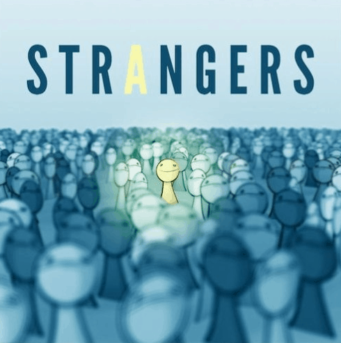
For example, the Strangers podcast uses an image that helps you understand what their show is about.
6. Limit the number of words you use
Your artwork needs to be readable in small sizes, so don’t try to pack in a paragraph (or even a long sentence). Use your show’s name as the main headline. Subheadings are okay, but keep them short and punchy.
Slate’s Slow Burn doesn’t bother with a lot of words. It only use’s the podcast’s title and the brand name. It lets the highly recognizable image do all the work.

7. Stay away from overused images like microphones or headsets
Microphones, headsets, and other images relating to podcasting are cliche at this point. Avoid them if you can, even if your show is about podcasting. Otherwise you won’t stand out.
S-Town is a story podcast about a scandalous town in Alabama. The cover art uses eye-catching colors and unique imagery. You don’t normally see flowers and clocks together like that, so it makes you wonder what the podcast is about.

8. Make your cover artwork consistent with the rest of your branding
Use the same copy, images, fonts, and colors. The goal is to create a consistent feel across your entire brand, no matter where your fans interact with you. This helps them create a connection to you.
9. Don’t be afraid to use your logo
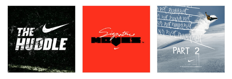
If your podcast is part of a larger organization that people already recognize, your podcast cover art should leverage that branding. Notice how Nike includes their switch logo on all of their podcast art.
10. Use high-resolution images
Since your cover art will typically be displayed small, you want it to be as clear as possible. If your podcast cover is grainy, blurry, or skewed to odd proportions, potential listeners will scroll right by it. They will assume your poor cover art is a reflection of your show’s poor production value.
11. Choose contrasting colors
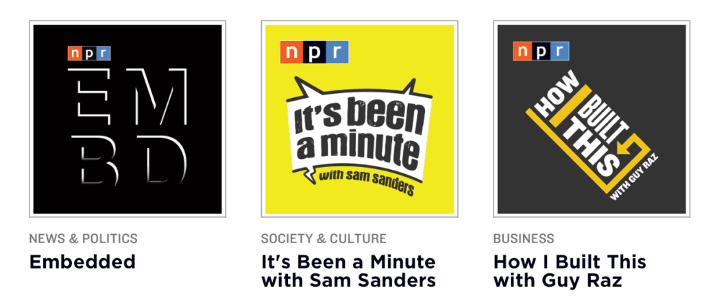
Bold colors helps you stand out from the crowd, especially if your colors are vibrant and eye-catching. Notice how these cover images pop out at you because they use contrasting blacks, grays, whites, and yellows.
12. Don’t crowd your podcast cover art with too much content
White space is a critical element of any design, so don’t crowd your image’s elements.
We love this podcast cover art because of its vivid, eye-catching colors, but it isn’t crowded with complex images or text. The colors and the expression on the woman’s face make it stand out.

13. Make your cover image adjustable for other mediums
For instance, you might want to use your cover art to promote on Facebook, as a static image when you republish on YouTube, or as some part of your podcast website. Consider the dimensions of these locations as you design you image.
14. Avoid explicit or adult-only images and language
These items either violate the terms of the big podcast directories and/or turn people away from your show.
- References to drugs, sex, gore, profanity, violence, or hate themes.
- Images or languages that reference racism, homophobia, or misogyny.
- Complex words that most people won’t understand.
15. Avoid words images that are the intellectual property of other brands
These violate the rules of most podcast directors. Using someone else’s property can also get you in a lot of trouble (unless you have permission to use them).
16. Don’t be afraid to use your face
If your audience knows you well, it might be smart to use your face on your podcast cover art. This is Your Life by author and coach Michael Hyatt does this well. Also notice how his image matches the branding on his website precisely.

In fact, Lots of famous people put their faces on their podcast cover art.

17. Preview your cover art every across podcasting apps
Make sure your podcast artwork looks great before submitting it. Use Podcast Artwork Check to preview it on multiple platforms.
How to Make Your Own Podcast Cover Art or Logo
Ready to make your own podcast cover art? You have two options here: 1) You can either pay someone to make it for you using a service like 99designs or Fiverr. 2) Make it yourself using a DIY design tool like Canva, Tailor Brands, or Adobe Spark.
99designs (paid)
99 designs is a design platform that gives you access to thousands of talented designers. You simply tell them what you want designed and hire a designer. You can also open your request to the community, let designers pitch you ideas, and pick your favorite. Learn how it works.
Fiverr (paid)
Fiverr is another platform for designers. You have to find the designer that’s right for your needs, but it’s significantly cheaper than most design services. Search for designers who offer gigs specifically for podcast art (or just click here). Learn how it works.
Canva (DIY)
Canva is a self-service design tool that’s it’s easy to use and free. It can be used to create any kind of artwork, so you’ll find it useful to create social media images, graphs and charts, blog post featured images, etc. We recommend playing around with it for a bit to learn how it works.
Once you sign up for Canva and enter your dashboard, click the Create a Design button, select + Custom Dimensions, and enter 3000 for height and width. The page that opens is your work space. This is where you’ll add photos and text to create your podcast cover art. Make sure to check out their design tutorials.

Visme (DIY)
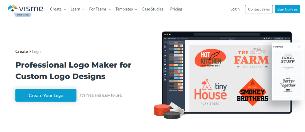
Visme is a visual content creation tool that lets you create logos, videos, infographics, presentations, animations, and other forms of visual content. Visme is easy to use, yet can be used to create professional-looking assets with little to no design skills.
Visme combines simplicity with flexibility. A large collection of templates and visual elements that can be included, allows you to create engaging visual content.
Tailor Brands (DIY)
Tailor Brands is a simple way to create a logo in minutes. Their AI-based system asks you a few questions about your preferred style and then comes up with unique artwork just for you. You can then customize it to make sure it’s perfect. Learn how it works.
Adobe Express (Free Templates)
Creating podcast cover art is easy: Simply choose one of their professional templates and add your logo, images, and text. Creating a cover only takes a few minutes. Learn how it works (scroll to the bottom).

Frequently Asked Questions About Podcast Cover Art
Here are some common questions podcasters ask about thier podcast cover art.
Should I use different covert art images for each episode?
Generally, you want consistency with your podcast cover so people learn to recognize your brand. Your logo and tagline should stay the same. But it’s alright to make some changes to keep things fresh. For instance, you might:
- Add the title of the episode
- Add the image of a high-profile guest to entice listeners.
- Update the cover art for special episodes to make them stand out (like anniversaries, look backs, season finales, etc.).
- Add special imagery to help the audience understand what the image is about.
Just remember to keep some consistency so listeners can tell at a glance that the episode is part of your show. You don’t want them to think it’s a new podcast every time.
Can I change my podcast cover image after my show launches?
Yes. According to many members of Podcast Movement, there aren’t any negative effects of updating your cover art image. Your podcast evolves over time and so can your cover art.
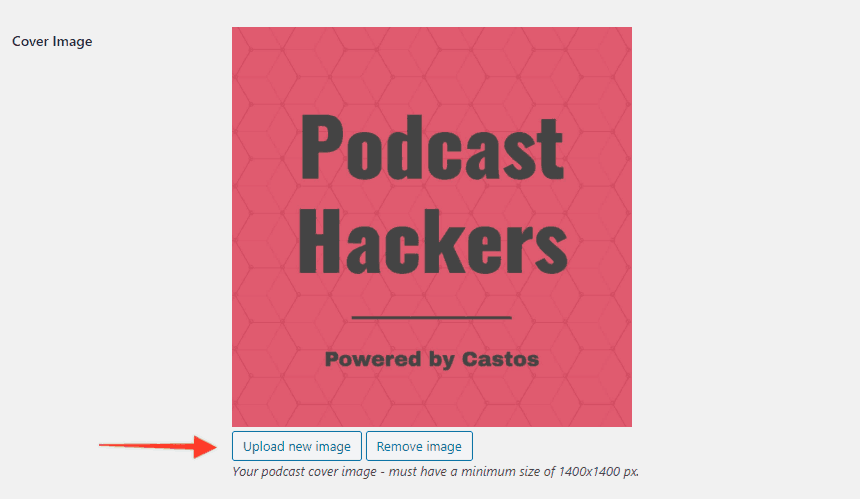
To change your podcast cover art in Castos, visit the “feed details” page of your podcast settings.

Then click “Upload new image” to replace your existing image. This will open the WordPress Media Library.
I changed my podcast cover art but it’s not updating in Apple Podcasts. Why?
First, make sure the new cover art has a different file name the one you’re replacing and that it meets Apple’s image restrictions. Wait 48 hours for it to take effect. If it doesn’t appear after two days, reach out to [email protected] and let them know of the issue.
My RSS feed has an error because of my podcast cover art image. What should I do?
If you ran your RSS feed through a podcast validator (like Podbase) and got an error, try these fixes:
- If the file size is too large, compress using Squoosh and saves as a JPG (not a PNG).
- If the file is the wrong dimensions, resize using Canva or Squoosh.
- If the file has the wrong DPI, convert it using Clideo.
Summary
Your podcast cover art is a critical element of your brand. It’s the image listeners see every time they play an episode, and it’s the first thing potential listeners see when they search for new content.
If your artwork is boring, uninspiring, and similar to everything else, potential listeners won’t get try your show. They’ll scroll right past your name as they look for something exciting. So it’s important to use the tips and tools we explained above to design high quality podcast cover art for your brand. It could be the difference between a big, engaged audience and no audience at all.


Comments are closed.