iOS 17 is coming out soon and it includes one change that podcasters will enjoy: episode artwork.
Episode artwork is a unique image you can attach to each episode via your RSS feed. Apple Podcasts will display this image in select locations through Apple products.
Episode artwork gives listeners the opportunity to learn more about each episode with a photograph, illustration, or graphic.
This feature is also included in iPadOS 17, macOS 14, watchOS 10, and tvOS 17. The release date is set for the fall of 2023. See more details here.
Where Does Your Episode Art Appear?
Apple will begin displaying your episode artwork in the following locations:
- Episode Pages: Your artwork will display alongside the show name and episode title.
- Show Pages: Your artwork will be presented next to the title and description for each episode in a list format.
- Now Playing: The main art will be your episode art. Your cover art will be displayed lower and to the left.
- Lock Screen: Your episode art will be displayed in the media controls section.
- Control Center: Access detailed media controls, including your podcast’s art.
- Listen Now: This is a redesign of the Up Next section. Your episode art will fill the card. Your cover art will be overlayed at bottom.
- Links: When you or someone shares a link to the episode, the episode artwork will be used as the preview image.
- Link Previews: The episode artwork will be displayed in other apps, such as Messages, Mail, and other iOS apps.
Your episode artwork will not appear in places where Apple advertises your overall show, like the Browse page, category pages, Top Charts, search results.
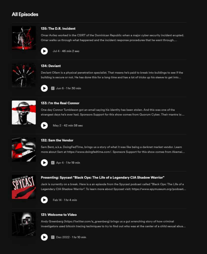
Since Apple Podcasts hasn’t introduced episode artwork yet, we can’t show you an example. But Apple isn’t an innovator here. Other listening apps, like Spotify, already allow unique artwork for each episode. Here’s an example of Darknet Diaries on Spotify.
Which Shows Will Have Access to Episode Artwork?
All shows that are listed on Apple Podcasts will gain access to episode artwork.
Keep in mind, however, that this update only applies to Apple products. While several podcast listing apps support episode images, others don’t at this time.
In our experience, Apple tends to set the standard when it comes to podcasting, so we expect other platforms will include episode artwork in the future.
What If You Don’t Have Episode Artwork?
Whenever episode artwork is missing, Apple will use the cover art. It will also show the cover whenever multiple shows are displayed alongside each other.
How Do You Serve Episode Artwork?
Episode artwork is delivered to podcast listening apps in two ways: ID3 tags and the RSS feed.
ID3 tags are metadata embedded in your audio files. They include things like title, author, text, and images. Technically you can add multiple images, but we recommend just using one so the listening apps don’t get confused.
An ID3 editor such as ID3 Editor from PA Software or Mp3Tag will let you add ID3 images. These are not links to an external host. The image data is added to the audio file.
In your RSS feed, there are two places that can hold your episode artwork:
- The <itunes:image> tag from Apple’s “iTunes namespace”
- The <podcast:images> tag from the Podcasting 2.0 “podcast namespace.”
Both tags require an image URL, which means you have to host the image file somewhere accessible in order to display it with your podcast.
The <podcast:images> tag is unique, however, because you can store more information than just the image URL. You can specify different images with custom sizes. For instance, you might include three images (150 pixels, 600 pixels, and 1,200 pixels) for when your episode artwork is displayed at different sizes.
Which format should you use? Some apps use ID3. Some use RSS. As you can see from the chart below, there’s no consistency. So for the time being, you should use both formats to ensure your episode artwork is visible as often as possible.
| Player | Displays image from RSS | Displays MP3 ID3 image |
|---|---|---|
| Apple Podcasts | No | No |
| Pocket Casts | No | Yes |
| Google Podcasts | No | No |
| Spotify | Yes | No |
| Castbox | Yes | No |
| Podcast Addict | Yes | No |
| Stitcher | No | No |
| Overcast | No | Yes |
Is Episode Artwork Worth the Trouble?
Episode artwork is still relatively new. Some listening apps will display it, but others haven’t come around yet and may not. So some listeners just won’t see it.
Plus, podcasting is an audio medium. Some people won’t see your episode artwork because they just won’t look at it. They listen to your show while they cook, exercise, drive, or walk the dog. This is one of the few activities on their phone where they don’t stare at the screen.
So is making episode artwork worth the trouble? In our opinion, yes, it’s worth it.
First of all, unique imagery enhances the experience. It’s not going to be the rocket ship that launches you into stardom. It won’t make you one of the most popular podcasts. But it can make your show look professional, dynamic, and compelling.
Furthermore, you can use the custom artwork as part of your podcast marketing. You could…
- Make it the featured image of each unique post on your podcast website.
- Post it on social media to promote each episode.
- Include it in your email newsletter when you promote the episode.
- Make it the background image in each audiogram.
Episode Artwork Best Practices
Now that you understand how episode artwork works and where listeners will see it, let’s go oer some best practices to help you create quality imagery.
Keep things simple
Just like your podcast cover art, it’s important to keep your episode artwork clean and simple. It will be displayed at a variety of sizes. It should be understandable even when it’s small. Avoid complex wording and too many details.
Follow the same technical guidelines
The requirements for episode artwork is the same as cover artwork:
- Dimensions should be 3,000 pixels by 3,000 pixels.
- Acceptable file formats are JPEG or PNG.
- Colors should be RGB and 72 dpi.
- Don’t add periods to your filename.
- No references to drugs, sex, gore, profanity, violence, racism, homophobia, or hate themes.
Use consistent branding
On one hand, your episode artwork should use your brand colors, fonts, and style. On the other, you want them to be distinguishable from one another so they feel new. It’s a hard balance to achieve.
If you produce seasons or multi-part episodes, consider using a similar artwork for each so listeners can see the relationship at a glance. If a podcast is just one part of your business, don’t be afraid to use your company logo so people associate it with your show.
Use people’s faces
People love connecting with faces, which is why they’re so popular on YouTube thumbnails. Take advantage of this effect by adding your face or your guests’ faces to each episode artwork.
Stick to simple fonts
Personality is one thing, but crazy fonts are hard to reach, especially when the image is displayed small. If someone can’t read the text on your artwork, they will probably scroll by.
Furthermore, stick to one or two fonts, but no more. Anything more is distracting.
Avoid overused imagery
Images of microphones and headsets are outdated and cliche at this point. If someone is previewing your show on a listening app, they know it’s a podcast. Instead, use imagery that tells a story and entices new listeners to check it out.
Use high resolution photos
Since your artwork will be displayed at multiple sizes, it’s important that you make it clear. Use high resolution photos or artwork so it always looks good.
Choose contrasting colors
Bold colors help you stand out, especially if they’re vibrant and eye-catching.
Don’t crowd your content
Whitespace is a critical part of good design, especially when it comes to small images. Try not to fill every bit of space in your image. Limit the number of words you use and make sure to keep some space around the edges.
How to Create Your Own Episode Artwork
As you can see, episode artwork and cover artwork aren’t very different, which means we can use the same tools and resources to make both.
The easiest way to create episode artwork is with Castos Dynamo, an entirely free tool that lets you create a stunning image for your podcast with just a few clicks.
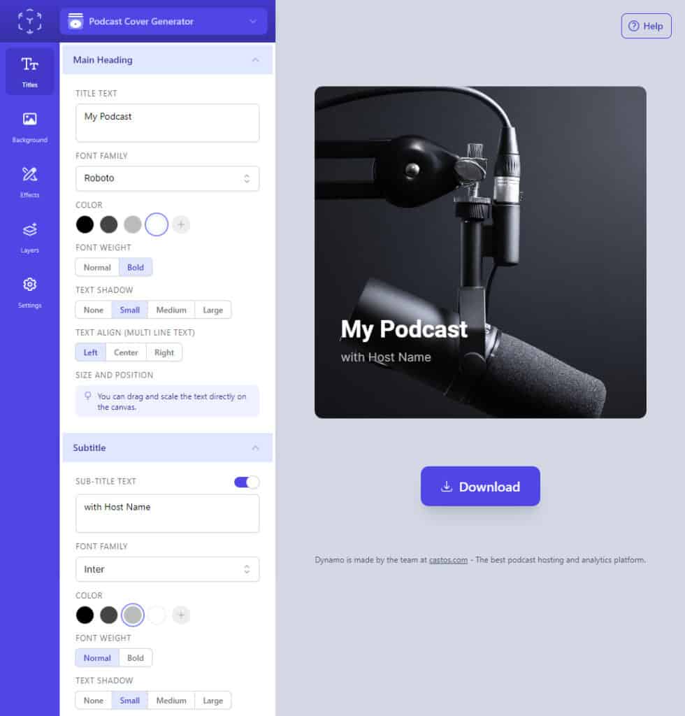
There’s no need for expensive and complex tools like Photoshop. Dynamo was specifically created to help you make great podcast imagery without technical or design skills.
You can create as many free images as you like. With options for background colors, gradients, or images along with text and effects you can make it all your own. Once you have your new image, add it to your RSS feed with your episode so it displays wherever your show is listed.
